Mid-Autumn 2023
Lai Ching Heen
DASH has recently unveiled a captivating packaging design for the esteemed Lai Ching Heen, a globally recognized Cantonese restaurant renowned for its Michelin stars and Forbes accolades. This packaging project, a harmonious blend of tradition and innovation, reflects DASH’s prowess in graphic design and packaging aesthetics.
sector
food service
work
art direction / print design / packaging design
Lai Ching Heen
Mid-Autumn 2023
DASH has recently unveiled a captivating packaging design for the esteemed Lai Ching Heen, a globally recognized Cantonese restaurant renowned for its Michelin stars and Forbes accolades. This packaging project, a harmonious blend of tradition and innovation, reflects DASH’s prowess in graphic design and packaging aesthetics.
sector
food service
work
art direction / print design / packaging design
CHALLENGE.
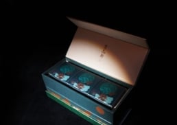
The primary challenge for DASH was to integrate Lai Ching Heen‘s existing brand elements – Fish, Jade, Stamp, and Wave patterns – into a fresh, luxurious packaging concept for their mid-autumn mooncake. The task involved not only preserving the essence of Lai Ching Heen‘s identity, represented by their signature Jade color and light green, but also infusing a modern touch that resonates with the brand’s upscale image.
DESIGN AND CONCEPT.
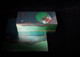
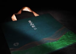
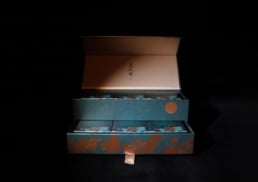
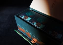
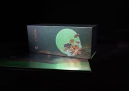
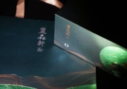
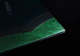
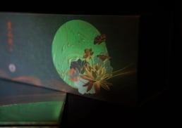
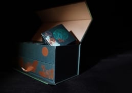
DASH’s design concept revolves around an elegant utilization of the brand’s jade color, complemented by light green accents and touches of gold to add a sense of luxury. The key visual element is a Jade moon, adorned with a golden wave pattern and lotus motifs, symbolizing the Mid-Autumn Festival. Upon opening the mooncake box, customers are greeted with a stunning gold foil stamp depicting a night view with a moon and lotus, encapsulating the cultural essence of mooncake festivities. This design not only maintains the brand’s identity but also adds a contemporary and original twist, showcasing DASH’s expertise in packaging and graphic design.


