Popway Residence Tennoji
Popsible Group
Popway Residence Tennoji is an up-and-coming chain of residences developed for vacationers and working professionals alike. The hotel wanted to distinguish itself from others with its uniquely colorful and “Pop”ing aesthetics. DASH was hired to help lead the marketing and for the buildings, specifically using the bold, warm and inviting art direction, to attract travelers from across the country.
sector
hospitality
work
brand identity design / visual system design / brand tone and voice / brand guidelines / collateral design / interior and exterior graphic design
Popsible Group
Popway Hotel Hong Kong
Popway Residence Tennoji is an up-and-coming chain of residences developed for vacationers and working professionals alike. The hotel wanted to distinguish itself from others with its uniquely colorful and “Pop”ing aesthetics. DASH was hired to help lead the marketing and for the buildings, specifically using the bold, warm and inviting art direction, to attract travelers from across the country.
sector
hospitality
work
brand identity design / visual system design / brand tone and voice / brand guidelines / collateral design / interior and exterior graphic design
CHALLENGE.
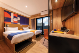
Popway Residence Tennoji has 39 chic-inspired premium residences, ranging from studio apartments to two-bedroom suites. While the “Pop” aesthetic is exuberant and inviting, it can sometimes lend an air of informality. Prospective clients – particularly business visitors and older travelers – may not consciously connect premium amenities with a hotel that boasts of such a young aesthetic. The challenge in this campaign was to create a messaging that positioned Popway Residence Tennoji as the ideal residence to stay at for both families on holiday and business visitors.
DESIGN AND CONCEPT.
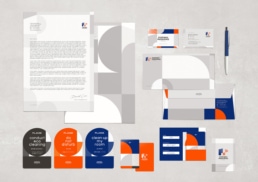
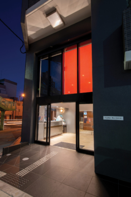
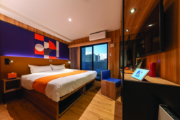
The management of the Popway Residence Tennoji wanted the shapes and colors associated with “POP”, to be the central feature of their brand identity design. DASH made use of color psychology to convey the right message that enabled the hotel to be both classic and contemporary at the same time.
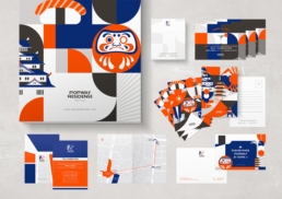
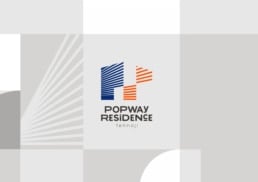
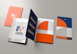
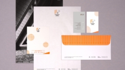
Since Popway Residence Tennoji’s brand logo was inspired by the sun and its sunlight, our team tapped into sun symbology and iconography to create an imagery that was bright, airy and magnanimous. By using a combination of orange, blue and black amidst much whitespace, the brand print/collateral design appeared at once premium and accessible.
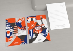
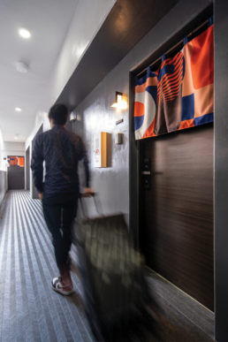
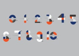
While the bright colors lent youthfulness and energy to the brand identity design, the use of geometric shapes in the print/collateral design, added an upmarket and sophisticated aesthetic. Combined to this were elements of Japanese art, signifying the international nature of the residences and inviting clients from around the world. Steeping Popway Residence Tennoji’s print/collateral design in an ancient culture, also added an air of mystery that curious travelers seldom are able to resist.
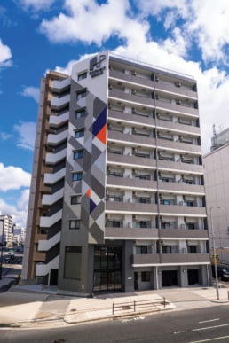
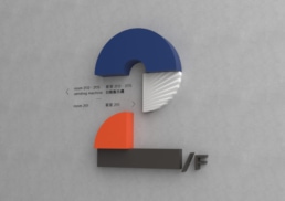
All of the collaterals – internal (key cards, room art, taxi cards, door hangers etc.) and external (signage, lobby art, wall art etc.) – mimicked this theme of “Pop”. This made the Popway Residence Tennoji more visually memorable and alluring. A greater number of inquiries and bookings were noticed after the implementation of such a distinctive visual brand identity design by DASH.


