Mid-Autumn 2019
Häagen-Dazs
Crafting a story and delivering design for the marketing of Häagen-Dazs’ limited edition ice-cream Mooncakes celebrating the Mid-Autumn Festival.
During the Mid-Autumn Festival, it’s customary to exchange the gift of Mooncakes. While traditionally filled with red bean paste, many food and beverage brands reinterpret this tradition giving their customers new twists on classic recipes. Häagen-Dazs gives the age-old Mooncake a contemporary spin with fillings of its renowned ice cream. To celebrate this year’s Mid-Autumn Festival, DASH worked with Häagen-Dazs to bring concepts and stories to the brand’s limited-edition Mooncakes.
sector
food and beverage
work
creative direction / art direction / packaging design / key visual / food styling / food photography / print design / out-of-home advertisement design / point-of-sale material design
Häagen-Dazs
Mid-Autumn 2019
Crafting a story and delivering design for the marketing of Häagen-Dazs’ limited edition ice-cream Mooncakes celebrating the Mid-Autumn Festival.
During the Mid-Autumn Festival, it’s customary to exchange the gift of Mooncakes. While traditionally filled with red bean paste, many food and beverage brands reinterpret this tradition giving their customers new twists on classic recipes. Häagen-Dazs gives the age-old Mooncake a contemporary spin with fillings of its renowned ice cream. To celebrate this year’s Mid-Autumn Festival, DASH worked with Häagen-Dazs to bring concepts and stories to the brand’s limited-edition Mooncakes.
sector
food and beverage
work
creative direction / art direction / packaging design / key visual / food styling / food photography / print design / out-of-home advertisement design / point-of-sale material design
Challenge.
This was the third consecutive year that DASH worked for Häagen-Dazs to design and develop the story and concept around their Mid-Autumn Festival Mooncakes. As a festival steeped in tradition, Häagen-Dazs needed a strong concept and story to link its ice cream with the festival, positioning its Mooncakes as a special treat or gift family and friends can share.
Design &Creative Concept.
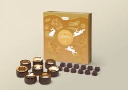
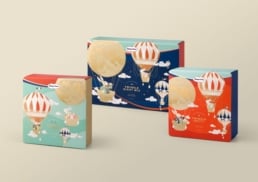
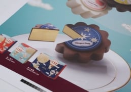
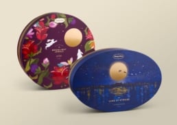
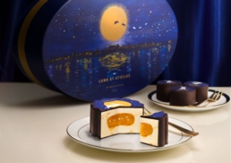
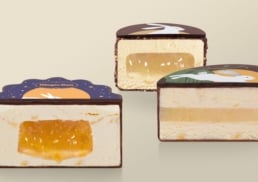
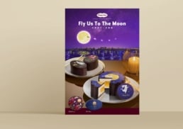
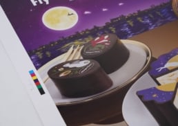
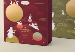
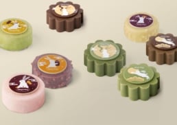
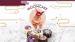
Häagen-Dazs Mooncakes are inspired by the spectacle of the brightest and roundest moon of the festival and its contemporarily-designed Mooncakes are each filled with different flavoured ice creams.
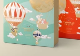
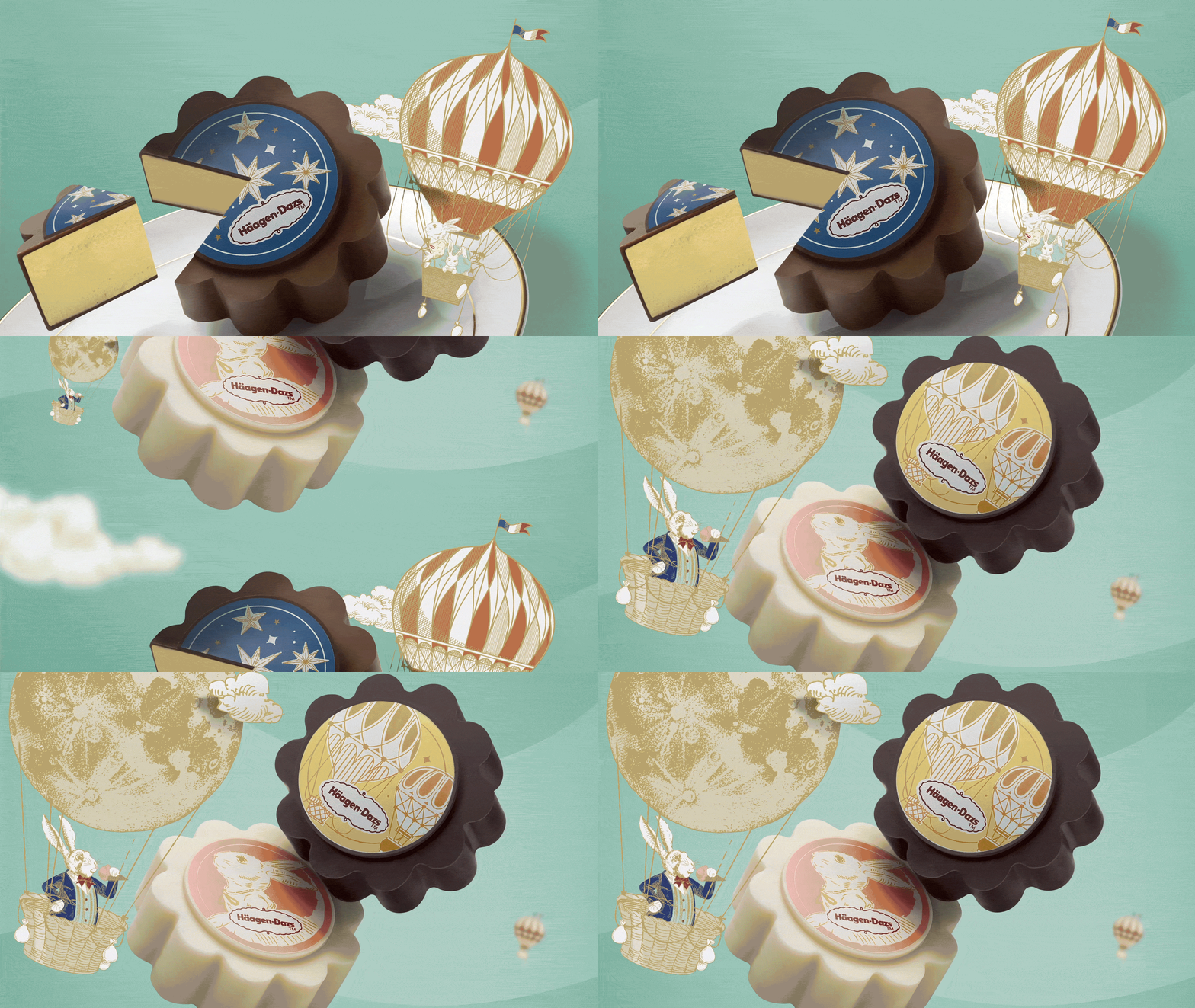
The Moon Rabbit is a famous symbol of the mid-autumn festival and DASH drew on this character to create a unique fairytale in an Alice in Wonderland-inspired story. By connecting the meaning of the festival with this fantasy tale in its marketing message, DASH was able to make a stronger connection between the Mid-Autumn festival and Häagen-Dazs’ products.
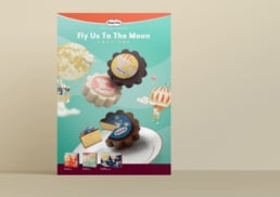
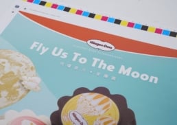
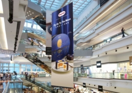
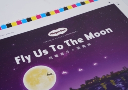
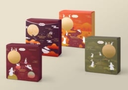
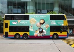
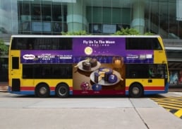
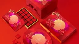
Through a series of unique packaging designs, DASH ensured Häagen-Dazs’ Mooncakes stood out from other brands in the market which tend to take a more traditional design approach. Two key visual design were used for advertising and communication across the brand’s marketing for the festival.
