Chinese New Year 2020
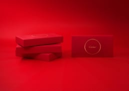
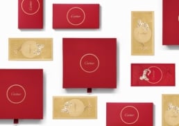
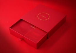
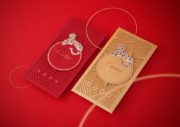
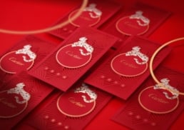
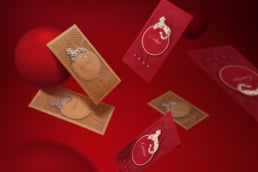
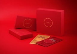
We worked for renowned French jeweller Cartier to design and develop luxurious red and gold packets and gift boxes celebrating the Chinese New Year.
At Chinese New Year, it’s tradition to give the gift of bright red or gold envelopes to friends and family. We helped Cartier to share the joy and happiness of the season with its customers by creating a set of Chinese New Year packets and gift boxes that showcase the brand’s luxury and exclusivity.
sector
luxury goods
work
creative direction / art direction / red packet design / packaging design / print and production
Challenge.
Chinese New Year is one of the biggest holidays in the calendar leading to tight competition between brands as they strive to set themselves apart. As one of the world’s most luxurious labels, Cartier is associated with classic products, service and exclusivity. When it came to design and branding of the red envelopes and gifting elements, no ordinary design would do. Every aspect of the design needed to reflect the luxury and quality, prestige and sophistication that the French jewellery house represents.
Creative Design &Development.
The first stage of the project was to gain a thorough understanding of the brand and elements that needed to be incorporated into the design. From this discovery phase we understood that Chinese lanterns – symbols of joy and good fortune – were a key part of Cartier’s Chinese New Year 2020 campaign and should play a central role to create consistency across communications.
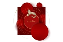
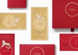
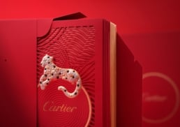
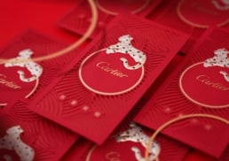
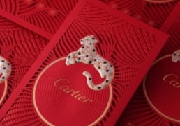
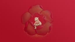
For the design, we paired festive Chinese lanterns with Cartier’s signature panther, the exotic and majestic symbol of the house. The Cartier panther motif was given a new luxury look to highlight the fine craftsmanship and creativity of the brand and the celebratory spirit of the Chinese New Year season.
Communicating a Sense of Luxury.
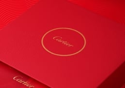
A number of design details communicated the brand’s luxury prestige. The colours gold and red are not only associated with Chinese New Year but with success, affluence and extravagance. Embossed details, such as flowers and elements on the lanterns, communicate a sense of craftsmanship and attention to detail. The chosen typeface conveys elegance, class and the confidence and timelessness of the Cartier brand.
In addition to creative and design, DASH supported Cartier through the print and production process, undertaking a strict quality check to ensure the final result met Cartier’s discerning standards.


