Grand Central
Sino Land
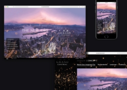
Sino Land hired DASH to create the art direction, design and development of a website advertising the Grand Central property development.
Located in Kwun Tong, Grand Central is set to become a world-class integrated city in Hong Kong’s upcoming CBD, positioning itself as an international centre for financial services, trade and shipping. With mixed-use residential, commercial, food and beverage and leisure facilities, developer Sino Land tasked Dash with the art direction, design, development and content formatting of a website to advertise the Grand Central complex.
sector
real estate
work
art direction / web design / ui and ux design / content formatting / web programming
Sino Land
Grand Central
Sino Land hired DASH to create the art direction, design and development of a website advertising the Grand Central property development.
Located in Kwun Tong, Grand Central is set to become a world-class integrated city in Hong Kong’s upcoming CBD, positioning itself as an international centre for financial services, trade and shipping. With mixed-use residential, commercial, food and beverage and leisure facilities, developer Sino Land tasked Dash with the art direction, design, development and content formatting of a website to advertise the Grand Central complex.
sector
real estate
work
art direction / web design / ui and ux design / content formatting / web programming
Challenge.
The website for the new property is likely to be one of the first pieces of marketing that potential tenants interact with. DASH needed to ensure that the website user experience was smooth, pleasant and intuitive in order to give a positive first impression.
At the time of commissioning the website, Grand Central was still under development. Without final images of the property, DASH was challenged to build a strong visual identity for the client – including colour, typography and content structure – using 3D rendering and text features provided by the client. DASH needed to ensure the website would accurately reflect the concept and environment of Grand Central while making it easy for the client to update and add information to the website as it became available.
Design &Creative Direction.
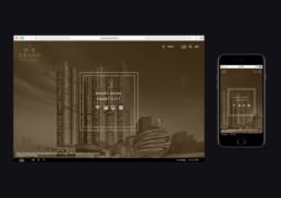
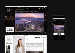
To inform the design and art direction for the project, DASH undertook a range of research to better understand the concept behind Grand Central, its surrounding area and the development of the wider CBD hub. DASH drew on the project’s “Smart Home, Smart City” concept to build a modern and appealing website. At the same time, DASH knew it was important to add a feeling of luxury to the site, in line with the development’s “Grand” theme, architectural style and craftsmanship. This feeling of luxury is communicated through the website’s black and gold colour assets which communicate sophistication, prestige and abundance.
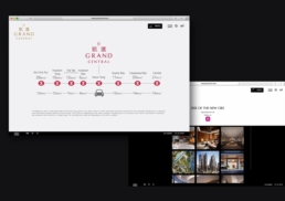
The site was designed with long scrolling to allow users to explore key pieces of content without interruption. The benefit of using one-page long scrolling is that it can increase a visitor’s time on the site and their engagement with content, optimising clicks and interactions and reducing bounce rate. Long scroll not only helps to keep users engaged, but with an increasing number of users browning the website via their mobile phones, the infinite scroll is easier for mobile audiences to explore over switching to new tabs which can feel cumbersome.
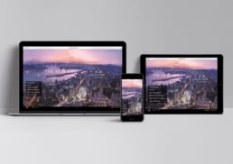
DASH implemented responsive design on the website to ensure that content automatically scaled to the optimal viewing size for the screen it is being viewed on, whether mobile, desktop or laptop. Responsive design avoids the frustration that can be caused by having to zoom, resize or scroll to clearly view certain elements of a website – the page automatically scales up or down and is optimised for whichever device is being used.
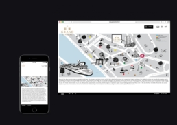
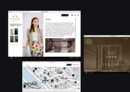
As a final touch, DASH wanted to ensure that visitors could get a better idea of the surrounding area and the lifestyle Grand Central offers to tenants. DASH created an illustrative map featuring points of interest, landmarks, services and amenities nearby. The map acts as a key point of engagement and interactivity on the site, bringing the CBD to life and positioning Grand Central as an appealing lifestyle, residential and commercial hub.


