Fashion Hong Kong
In The Global Area
HKTDC
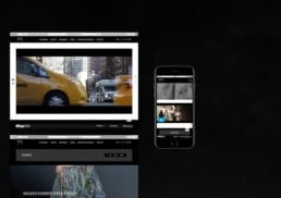
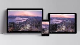
“Fashion Hong Kong” is a series of promotions by the Hong Kong Trade Development Council to present Hong Kong fashion designers and brands to the international audience. Since the major fashion weeks take place at different periods of time, our creative team was tasked to design an official website with a user experience and user interface that are both pleasing and useful, offering information on the past, ongoing and future fashion shows.
sector
business service
work
art direction / web design / ui and ux design / content formatting / web programming / content management system
HKTDC
Fashion Hong Kong
In The Global Area
“Fashion Hong Kong” is a series of promotions by the Hong Kong Trade Development Council to present Hong Kong fashion designers and brands to the international audience. Since the major fashion weeks take place at different periods of time, our creative team was tasked to design an official website with a user experience and user interface that are both pleasing and useful, offering information on the past, ongoing and future fashion shows.
sector
business service
work
art direction / web design / ui and ux design / content formatting / web programming / content management system
CONCEPT.
The best way to communicate with the website users is to immerse them in intriguing yet logically organized images of the fashion shows. Our creative team thus decided on six design elements for the user interface.
—–
Good Color Contrast
Larger Fonts
Larger Headlines
Bullet Lists
White Space
Sensible Organization
—–
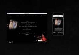
The landing page is the key. Are users tempted to explore other pages or do they want to leave right away? Their exit from the site can imply a poor user experience. At the same time, a successful fashion website needs to allow flexibility so that the content can be rearranged and updated according to the different shows and promotional periods.
UI & UX DESIGN.
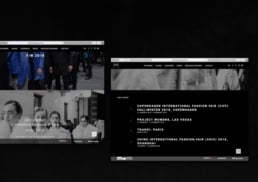
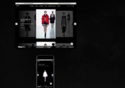
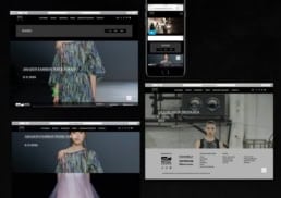
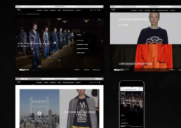
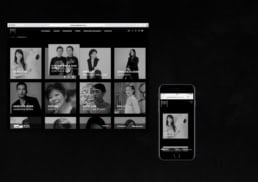
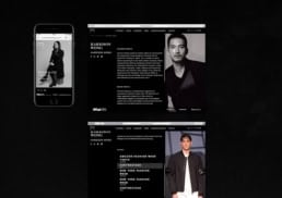
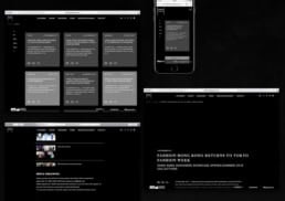
Our creative team picked black and white as the background palette of the website. The monochrome colors not only offer a neutral look to the site, but they also complement whatever colors the images are. The contrast also makes the text more readable. The images are kept neat, thin lines are used to divide the content, all unnecessary designs are avoided.
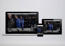
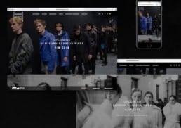
For smartphone and tablet computer users, we created an interface that echoes the design of the web version. Finally, we built a content management system for the client to update the web content easily.
Concept.
The best way to communicate with the website users is to immerse them in intriguing yet logically organized images of the fashion shows. Our creative team thus decided on six design elements for the user interface.
—–
Good Color Contrast
Larger Fonts
Larger Headlines
Bullet Lists
White Space
Sensible Organization
—–
The landing page is the key. Are users tempted to explore other pages or do they want to leave right away? Their exit from the site can imply a poor user experience. At the same time, a successful fashion website needs to allow flexibility so that the content can be rearranged and updated according to the different shows and promotional periods.
UI & UX DESIGN.
Our creative team picked black and white as the background palette of the website. The monochrome colors not only offer a neutral look to the site, but they also complement whatever colors the images are. The contrast also makes the text more readable. The images are kept neat, thin lines are used to divide the content, all unnecessary designs are avoided.
For smartphone and tablet computer users, we created an interface that echoes the design of the web version. Finally, we built a content management system for the client to update the web content easily.


