Standard Chartered x Cathay Pacific Chartered Flight to Taipei
The collaboration between Standard Chartered and Cathay Pacific for the “Chartered Flight to Taipei” event is a remarkable showcase of how graphic design can elevate brand experiences. The four-day journey, which included Priority Private and Priority Banking clients, as well as TVB travel series stars, was adorned with a unique visual identity crafted by DASH. The challenge lay in creating a cohesive visual language that balanced the strong brand identities of both Standard Chartered and Cathay Pacific while also capturing the essence of Taipei. Through a series of expertly designed collaterals, DASH successfully brought this vision to life.
sector
airline
work
art direction / key visual / visual identity design / collateral design / display design / printing and production / production and installation
Challenge.
Designing the key visual for this campaign was no small feat. Both Standard Chartered and Cathay Pacific are established brands with distinct visual identities. The primary challenge was to create a key visual that would not only resonate with both brands but also encapsulate the spirit of the Taipei trip. The color scheme was a crucial element in achieving this balance, as it needed to harmonize the two brands while also integrating the visual elements of the Taipei experience.
Another significant challenge was incorporating the Standard Chartered Cathay Mastercard, which was central to the campaign. The design had to ensure that this key element was prominently featured without overshadowing the overall aesthetic of the campaign.
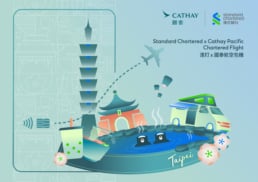
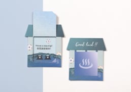
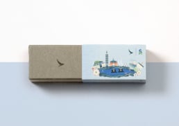
The key visual created by DASH serves as the cornerstone of the campaign’s visual identity. The design strikes a perfect balance between the brand identities of Standard Chartered and Cathay Pacific, using a carefully selected color palette that reflects the essence of both brands. The visual elements chosen to represent the Taipei trip were thoughtfully illustrated to evoke the city’s culture and vibrancy, while seamlessly integrating the Mastercard’s design elements.
Taipei’s iconic landmarks, such as Taipei 101, hot springs, and bubble tea, are prominently featured, symbolizing the journey’s destination. The use of soft gradients and clean lines reflects the sophistication of the event, while playful elements like lanterns and food trucks add a touch of local charm, making the design both elegant and inviting.
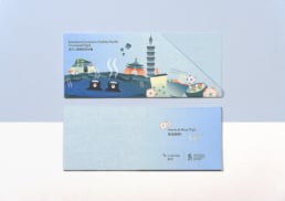
Collateral Design
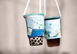
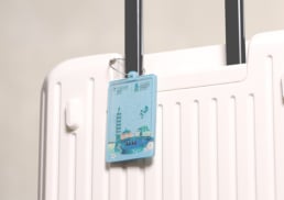
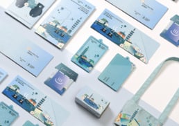
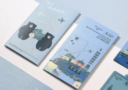
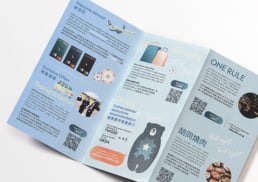
DASH extended the key visual’s design language across a range of collaterals, ensuring consistency and cohesiveness throughout the campaign. This included the design and production of cup holders, travel tags, rollup banners, tent cards at the dedicated flight check-in counter, ticket jackets, and leaflets.
Each item was meticulously crafted to align with the overall visual identity. For instance, the cup holders and travel tags featured miniaturized versions of the key visual, maintaining the same color palette and graphic style. This attention to detail ensured that the collateral not only served a functional purpose but also enhanced the customer experience by reinforcing the campaign’s theme at every touchpoint.
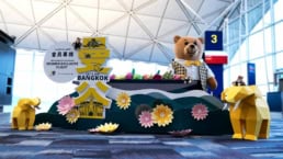
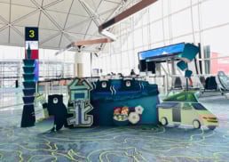
Visual Experience at the Boarding Gate
Upon arriving at the boarding gate, customers were greeted with a specially designed display that served as both a photo spot and a visual focal point. This display incorporated the key visual’s elements, including the Taipei skyline and cultural icons, creating a sense of anticipation and excitement for the journey ahead. DASH also designed and produced photo props that allowed customers to engage with the visual theme in a playful and memorable way.
Onboard Experience
To further enhance the in-flight experience, DASH extended the visual identity to various onboard items. This included designing TV screens, chocolate box sleeves, and game cards that echoed the campaign’s aesthetic. By doing so, DASH ensured that the visual narrative of the Taipei journey continued seamlessly from the ground to the air, providing passengers with a fully immersive experience.
Through a combination of thoughtful graphic design, strategic collateral design, and attention to detail, DASH successfully created a cohesive visual identity for the “Standard Chartered x Cathay Pacific: Chartered Flight to Taipei” campaign. The key visual served as the foundation for all collaterals, ensuring that every aspect of the customer journey was visually engaging and aligned with the campaign’s theme. This project is a testament to the power of graphic design in creating memorable brand experiences.
Design Concept.
The key visual created by DASH serves as the cornerstone of the campaign’s visual identity. The design strikes a perfect balance between the brand identities of Standard Chartered and Cathay Pacific, using a carefully selected color palette that reflects the essence of both brands. The visual elements chosen to represent the Taipei trip were thoughtfully illustrated to evoke the city’s culture and vibrancy, while seamlessly integrating the Mastercard’s design elements.
Taipei’s iconic landmarks, such as Taipei 101, hot springs, and bubble tea, are prominently featured, symbolizing the journey’s destination. The use of soft gradients and clean lines reflects the sophistication of the event, while playful elements like lanterns and food trucks add a touch of local charm, making the design both elegant and inviting.
Design Development.
Collateral Design
DASH extended the key visual’s design language across a range of collaterals, ensuring consistency and cohesiveness throughout the campaign. This included the design and production of cup holders, travel tags, rollup banners, tent cards at the dedicated flight check-in counter, ticket jackets, and leaflets.
Each item was meticulously crafted to align with the overall visual identity. For instance, the cup holders and travel tags featured miniaturized versions of the key visual, maintaining the same color palette and graphic style. This attention to detail ensured that the collateral not only served a functional purpose but also enhanced the customer experience by reinforcing the campaign’s theme at every touchpoint.
Visual Experience at the Boarding Gate
Upon arriving at the boarding gate, customers were greeted with a specially designed display that served as both a photo spot and a visual focal point. This display incorporated the key visual’s elements, including the Taipei skyline and cultural icons, creating a sense of anticipation and excitement for the journey ahead. DASH also designed and produced photo props that allowed customers to engage with the visual theme in a playful and memorable way.
Onboard Experience
To further enhance the in-flight experience, DASH extended the visual identity to various onboard items. This included designing TV screens, chocolate box sleeves, and game cards that echoed the campaign’s aesthetic. By doing so, DASH ensured that the visual narrative of the Taipei journey continued seamlessly from the ground to the air, providing passengers with a fully immersive experience.
Summary.
Through a combination of thoughtful graphic design, strategic collateral design, and attention to detail, DASH successfully created a cohesive visual identity for the “Standard Chartered x Cathay Pacific: Chartered Flight to Taipei” campaign. The key visual served as the foundation for all collaterals, ensuring that every aspect of the customer journey was visually engaging and aligned with the campaign’s theme. This project is a testament to the power of graphic design in creating memorable brand experiences.