Office Club ic
IFC Mall
Creating the brand language, key visuals and website for the launch of CLUB ic in Hong Kong’s International Finance Centre.
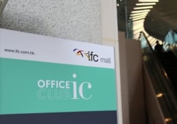
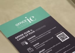
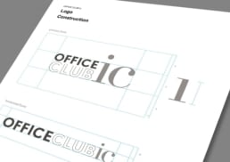
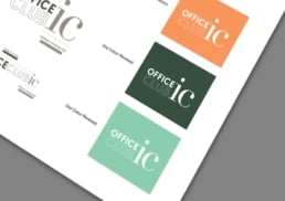
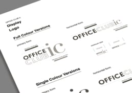
International Finance Centre (IFC) is a world-class business and leisure destination in Hong Kong. IFC launched CLUB ic, bringing distinctive lifestyle privileges covering shopping, dining and more at IFC mall to tenants in the building. IFC hired Dash to create the visual identity for CLUB ic, including the logo, typography, and colour pallet, as well as design and development for CLUB ic’s website.
sector
retail
work
brand identity design / art direction / print design / web design / ui and ux design / membership system / web programming / content management system / web hosting solution
IFC Mall
Office Club ic
Creating the brand language, key visuals and website for the launch of CLUB ic in Hong Kong’s International Finance Centre.
International Finance Centre (IFC) is a world-class business and leisure destination in Hong Kong. IFC launched CLUB ic, bringing distinctive lifestyle privileges covering shopping, dining and more at IFC mall to tenants in the building. IFC hired Dash to create the visual identity for CLUB ic, including the logo, typography, and colour pallet, as well as design and development for CLUB ic’s website.
sector
retail
work
brand identity design / art direction / print design / web design / ui and ux design / membership system / web programming / content management system / web hosting solution
Challenge.
For the launch of this new service, the visual identity needed to clearly communicate the values of CLUB ic, while remaining in line with the parent brand, IFC’s, existing branding. The key audience for CLUB ic is the tenants working in the building, primarily comprised of companies in the finance industry. The branding needed to appeal to this target market while still aligning with and complementing the existing brand language to show that the two brands were connected and related to one another.
Design &Creative Direction.
When creating the logo, colour scheme and typography assets of the brand’s visual identity, DASH made sure to closely adhere to the IFC Mall’s existing brand language. DASH ensured to use a similar colour temperature and bring a modern, fresh look and message to the brand language to complement the existing assets of the parent brand.
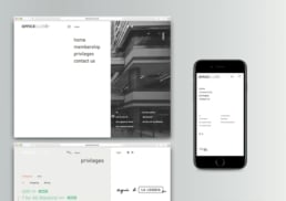
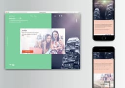
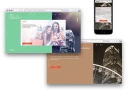
For the website, DASH wanted to move away from the traditional full-bleed image which extends from one side of the browser to the other. For a more modern and cleaner look, DASH incorporated white space and colour elements to give the design more structure and balance, while helping the branding and theme stand out and intuitively to lead the reader from one element to the other. Embracing white space over full-bleed also delivered more satisfying visuals, and helped to separate content on the page for a clean, minimalist look that complemented existing IFC mall branding.
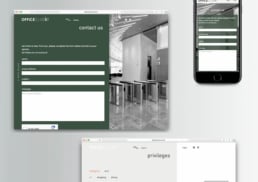
DASH understood that many of those using the site were from the finance industry, who are generally short on time due to busy schedules and high work demands. Priority was placed on creating a visually-appealing and initiative UI/UX design. Headlines and subheadings summarise the key message below, and visuals are surrounded by white space elements to bring focus for more digestible and accessible content. The website featured an intuitive and easy to navigate member registration and login system to ensure users could complete their registration and find the key information they needed fast.


