70 Years In Hong Kong
San Miguel
Logo design and brand guidelines for San Miguel Brewery Hong Kong’s 70th anniversary in the city.
San Miguel Brewery Hong Kong Ltd (SMBHK) is a brewery based in Hong Kong and a majority-owned subsidiary of San Miguel Brewing International Ltd. To celebrate the beer’s 70th year in the city, SMBHK hired DASH to create a brand identity design and brand guidelines for a logo and typography that would communicate this special anniversary.
sector
food and beverage
work
brand identity design / brand guidelines
San Miguel
70 Years In Hong Kong
Logo design and brand guidelines for San Miguel Brewery Hong Kong’s 70th anniversary in the city.
San Miguel Brewery Hong Kong Ltd (SMBHK) is a brewery based in Hong Kong and a majority-owned subsidiary of San Miguel Brewing International Ltd. To celebrate the beer’s 70th year in the city, SMBHK hired DASH to create a brand identity design and brand guidelines for a logo and typography that would communicate this special anniversary.
sector
food and beverage
work
brand identity design / brand guidelines
Challenge.
San Miguel is a well-known beer in Hong Kong. As this was a celebratory campaign, DASH needed to create a design that was distinct enough to set the commemorative bottles apart, while ensuring it complimented the brand’s DNA. While it was important that the design communicate a feeling of celebration, it needed to do so while being adaptable enough to be used as branding across San Miguel’s marketing and communications platforms and materials.
Design &Creative Concept.
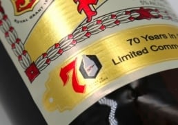
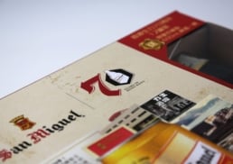
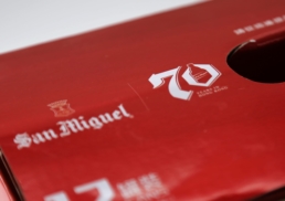
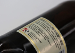
The logo needed to clearly stand out and immediately inform customers of the brand’s long history and 70 years in the city. As a first step, Dash carefully selected a typeface that was bold enough to stand out when placed on the bottle, yet still maintained consistency with the San Miguel brand language. To ensure the commemorative details weren’t too overbearing, DASH kept the same colour arrangement, leveraging the brand’s red and black elements for consistency. In Hong Kong, one of the things San Miguel is well-known for is the distinct shape of its bottle. For the logo, DASH incorporated this much-celebrated element in the number 70.
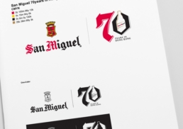
Finally, DASH created brand guidelines and a style guide for the logo to ensure it would be used consistently across marketing materials. The guide delivered direction on different colour uses, sizes, weighting and ratios, which would ensure the proper use of the logo whether it was placed on menus, on table displays or used in leaflets.


